No-index active: This page is excluded from search indexing and is not linked from user-facing navigation. It is an internal brand reference guide only.
tracker.cv Guidelines
The official style guide for tracker.cv. Use these guidelines to maintain a consistent, trustworthy job-search product identity across all surfaces.
Color SystemTailwind classes
Blue is the product anchor — it signals trust and data precision. Amber drives primary actions. Green confirms success states. Click swatches to copy hex values.
Brand Blue (Primary)
#2563eb
Core brand color. Navigation active states, primary buttons, icon accents, and links.
Brand Blue Deep
#172554
Used as foreground text on amber CTAs and for maximum-contrast display headings.
Blue Light (Surface)
#eff6ff
Subtle blue tint for icon backgrounds, feature chip backgrounds, and info callouts.
Amber (CTA Accent)
#fbbf24
Primary call-to-action color. Hero buttons, upgrade nudges, and highlight chips.
Amber Hover
#fcd34d
Hover state for amber CTAs. Lighter to convey interactivity without changing hue.
Emerald (Success)
#10b981
Confirmation states, AI-generated badges, and positive status indicators.
Slate Body Text
#64748b
Standard paragraph and caption text. High legibility on white surfaces.
Border Default
#e2e8f0
Card borders, dividers, and input outlines throughout the UI.
Amber CTA Button
Primary action pattern. Amber background with blue-950 text and amber shadow for depth.
bg-amber-400 text-blue-950 shadow-amber-400/20Dark Stats Band
High-contrast dark section used for social proof and metric callouts between content blocks.
bg-slate-900 text-whiteLogos & Brandmarks
Official assets for website, app, stores, and marketing. Checkered grids indicate a transparent background.
Logo on Light (Standard)
Full wordmark on a white background. Primary usage across the website, emails, and light-mode contexts.
Logo on Dark (Standard)
Full wordmark on a dark background. Use for dark-mode surfaces, footers, and promotional assets.

Icon on Light
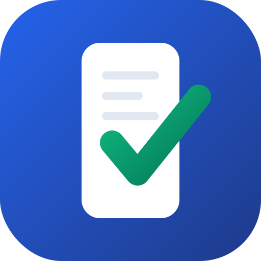
Standalone blue document+checkmark icon square. Use as app icon, favicon source, or compact avatar.
Typography Scale
Geist is the primary typeface — a clean, geometric sans-serif that reads well at every size. Syne is used for display moments requiring personality.
Geist Display
font-sans font-black / font-bold
Body & Data Stack
font-sans | font-mono
Track every application on a Kanban board. Generate a tailored CV and cover letter for each role in under 60 seconds. Free to start.
POST /api/cv/generateUI Components Playground
Pre-styled components built from the official Tailwind utility set.
Action Buttons
Cards & Containers
Application card
Standard job card in the Kanban board.
Featured feature
Used for pinned or promoted modules.
Kanban Column Accents
Each pipeline stage has a distinct accent hue. These are the approved column title styles.